Conversion rate optimization (CRO) is the process of improving the percentage of website visitors who complete a desired action. Such actions may include making a purchase, signing up for a newsletter, or downloading an application.
Intuitive web design can be an effective strategy for increasing website conversion rates. This article will explore the concept of conversion rate optimization and how to use intuitive web design techniques to improve conversion rates.
By understanding the user experience and designing an engaging homepage, businesses can optimize their website for maximum conversions. Additionally, businesses should consider the importance of optimizing for mobile devices in order to reach a wider range of potential customers.
Finally, this article will address the importance of testing and analyzing results in order to ensure that the design is effective and conversion rates are improving.
Understanding Conversion Rates
Examining the rate of successful outcomes is a key factor in determining the effectiveness of an online platform. Conversion rate is an important metric that measures the ratio of website visitors who complete a desired action, such as making a purchase or signing up for a newsletter.
By understanding customer preferences and analyzing user behavior, a web designer can make informed decisions for improving the user experience and increasing the chances of conversion.
A web design that is intuitive and user-friendly helps to drive customer engagement and boost the overall conversion rate. Elements such as a clear call-to-action, an engaging visual design, and a streamlined navigation system all contribute to an enjoyable experience that encourages users to take the desired action. The key is to create an environment that encourages customers to take the desired action, while also providing them with a sense of security and trust.
An effective web design should also take into account the customer’s subconscious desire for innovation. Incorporating methods such as personalization, gamification, and automation can help to create an enjoyable and interactive experience that encourages customers to take the necessary steps to complete the desired action.
By understanding and leveraging customer preferences and analyzing user behavior, web designers can create an intuitive web design that meets the customer’s needs and increases the chances of conversion.
Crafting an Intuitive User Experience
Crafting an intuitive user experience is essential for successful web design. To achieve this, web designers must ensure navigation clarity and content flow.
Navigation clarity refers to the ease with which users can find their way around a website, and content flow is about the logical arrangement of content so that users can find the information they want quickly.
Achieving an intuitive user experience involves understanding the user’s needs and preferences, and creating a design that meets those needs. This means that web designers must create a design that is attractive, easy to use, and meets the user’s needs.
This can be done by using elements such as colour, typography, and imagery that work together to create an inviting and interesting user experience.
Web designers must also ensure that the content is organized and easy to read. Content should be logically arranged and organized in a way that is intuitive for the user. This includes creating a navigational system that is clear and simple, and providing users with clear pathways to the information they are looking for.
In addition, content should be written in an engaging and interesting manner that encourages the reader to stay on the page and explore the content.
By creating an intuitive user experience, web designers can ensure that users have an enjoyable experience on the website, thus improving conversion rates.
Designing an Engaging Homepage
Designing an engaging homepage is essential to ensure users are captivated by a website’s content and are encouraged to explore its features.
Visual hierarchy is a key component of this approach, as it allows for a quick identification of the primary elements on the page and provides focus for users. This hierarchy should be arranged in an intuitive manner, to ensure users can easily understand the page’s purpose and navigate with minimal effort.
Additionally, a strong call to action should be included on the homepage, such as a sign-up button or a link to a product page, to further encourage users to explore the website.
Integrating these design elements in an efficient manner can help to keep users engaged, driving them to take further actions and increasing the website’s conversion rate.
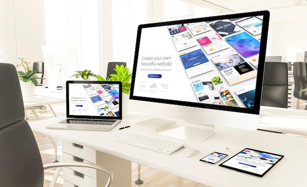
Optimizing for Mobile Devices
Optimizing a website for mobile devices requires an understanding of how users interact with a website on smaller screens, and the incorporation of design elements that enable an efficient user experience. Responsive design is the key to making sure the website looks and functions well on all devices.
Mobile analytics can give valuable insights into user behavior and device preferences. By combining these two concepts, web designers can create interfaces that are tailored to the user’s needs and provide an intuitive experience tailored to their device.
Web designers must take into account the user’s device type, screen size, and orientation when designing for mobile. Responsive design allows websites to adapt to different devices, ensuring that the website looks and works as expected regardless of the user’s device.
Additionally, mobile analytics can provide valuable insights into user behavior and device preferences, allowing designers to create interfaces that are tailored to their audience. This can help improve conversion rates by creating an intuitive experience tailored to the user’s device.
Finally, optimizing a website for mobile devices requires a combination of responsive design and mobile analytics to ensure that the website looks and works as expected across different devices. By understanding user behavior and device preferences, web designers can create interfaces that are tailored to the user’s needs and provide an intuitive experience that leads to improved conversion rates.
Testing & Analyzing Results
Testing and analyzing the results of a website’s performance on mobile devices is an essential part of the optimization process, and can help identify areas where improvements can be made.
For example, an analysis of user behavior can reveal that, on average, mobile users spend 40% longer on a website than desktop users.
Analyzing data over time is the best way to track the success of an optimization project. Split testing can be used to create a control group and a moving target, which can be compared to measure the effectiveness of changes. This also helps to identify the areas that need to be addressed, as well as the areas that are performing well.
Analytics can provide quantitative data that is essential for making informed decisions about the future of a website. In addition, qualitative data can provide insight into user preferences and behaviors.
By combining both types of data, businesses can create an intuitive design that is tailored to meet the needs of their users.
Frequently Asked Questions
How do I know if my website design is intuitive?
Understanding if a website design is intuitive requires a close examination of the elements that make up the user experience. A website should be designed with an intuitive flow, allowing visitors to move from one page to the next in a logical, easy-to-follow manner.
Additionally, it is important to consider the visual hierarchy of the website; the elements should be arranged in an order that is easy to understand and navigate.
A website design that is intuitive will lead to a better user experience, and improved website performance and conversion rates.
What are the most important elements to consider when designing a homepage?
When designing a homepage, it is essential to factor in appealing visuals and user experience in order to create a successful website. This means that the overall aesthetic should be visually appealing, while also providing a smooth user experience.
The homepage should be designed with the user in mind, incorporating easy-to-navigate menus, clear and concise information, and relevant content. Furthermore, it is important to create an atmosphere that encourages visitors to explore the website and keep them engaged.
By implementing these elements, a homepage can be designed to be both aesthetically pleasing and user-friendly, ultimately creating an innovative website.
How can I ensure my website is optimized for both mobile and desktop devices?
When optimizing a website for both mobile and desktop devices, two key elements must be considered: responsive layout and page speed.
Responsive layout ensures that the website’s content and design are correctly optimized for the device being used, and page speed ensures that the website is loading quickly and efficiently.
Together, these two elements can make a significant difference in a website’s user experience, leading to an increased conversion rate.
By carefully considering the design of a website and how it renders on different devices, web developers can create a website that is both intuitive and optimized for any user.
What methods can I use to track and analyze web conversion rates?
Measuring and tracking web conversion rates is an essential part of any business or marketing strategy. In order to gain insights and make informed decisions, it is important to have access to accurate data that can be easily analyzed.
There are a variety of methods that can be used to track conversion rates, such as using web analytics tools to measure website activity, tracking customer behavior, or running A/B tests. By doing so, businesses can gain valuable insights into user behavior and understand how to optimize their website for better conversion rates.
How much time should I devote to testing and analyzing results?
As a web designer, it is important to devote the necessary time to testing and analyzing the results of usability metrics and split tests in order to ensure the success of your web page. Making sure that you have ample time to devote to these tasks is key, as analyzing the results of split tests and tracking usability metrics can give you a better understanding of your web page’s performance.
Furthermore, split testing allows you to compare two different designs, giving you the opportunity to determine which design is more effective. With an analytical and results-driven approach to testing and analyzing the results, you can gain insight into how users interact with your web page and make the necessary changes to increase conversions.
Conclusion
The implementation of intuitive web design has been shown to be an effective strategy for improving conversion rates. Through careful consideration of user experience, the design of an engaging homepage, and optimization for mobile devices, businesses can increase their customer base and generate more leads.
By testing and analyzing the results of this strategy, businesses can evaluate its success and make further improvements to the website. Suspensefully, the potential for growth that lies within intuitive web design is vast, and the benefits to businesses that employ it are immeasurable.